Teamwork Part the Second

For our second group project, we had to put together something for a company at the Outdoor Retailer’s Expo in Salt Lake City. We had to have a booth mock-up, a brochure of some sort and a giveaway, and an interactive app.

We didn’t have to actually make the app, just mock up some stills, but I’ve been discovering that I like motion graphics a lot. So I wanted to make it work. It’s still got some glitches that I need to work out with another teacher, but here’s the non-interactive gif version. It should give you a pretty good idea of what I put together.

A gif version of an interactive graphic for Team Production Layout

A gif version of an interactive graphic for Team Production Layout

Each of the little pink dots will open up a panel with some information about each item. (That’s the part I’m having a glitch with; getting them to close or go back and forth.) The final scene will take the user to Roxy’s website and includes a special promo code.

The animation was done using Tumult Hype and the graphics were edited in Adobe PhotoshopCC and IllustratorCC.

Teamwork

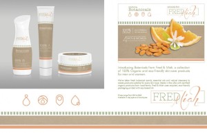
So this quarter I’m taking Team Production Layout Design (or something to that effect). It was formerly referred to as “the magazine class,” and we’d work in teams to create a magazine. It’s being changed up this quarter since we do magazine layouts in a lot of other classes and our first project was to create packaging for a new line of unisex cosmetics.

We were given the company name, a demographic and some suggested products. We had to do four products that showed a range of use, a physical mock-up of at least one and digital mock-ups of the others. Our team was given an extra person halfway through, so we also needed to do some kind of collateral. We chose to do a display sign.

So without further ado, I give you Fred & Miah.

layout-PRINT-REVISED

I did the layout and came up with the original color scheme (based on some handmade soaps I found) and did a lot of the original research on trends and other unisex products. There was a also lot of research on Etsy and I won’t lie, we took all of our products directly from existing homemade items that we thought fit with our vision. We knew from the start that we wanted to go eco-friendly and a lot of the packaging that we liked had a handmade, boutique feel to it. After adding in my research, it made sense to go in the direction we did with our products.

John had the original idea of doing something typographical for the logo. We weren’t focusing on the logo, so it made sense to keep it simple. I think the original three of us actually had similar ideas, but it was my sketches that we used, deciding to go with something simple and clean for Fred and feminine for Miah. John ultimately made the logo, since he’s better at them!

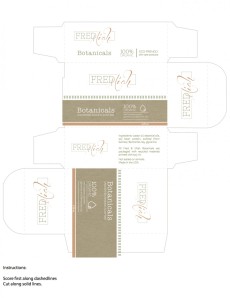
John also put together the digital comps and came up with the packaging designs and typography. Eduardo did the symbols we had decided to use: one for each type of product (exfoliating, shaving, washing and moisturizing). John had the idea of doing the symbols after finding something similar on some olive oil packaging. Eduardo also found the blank bottles and jars that were used in the digital mock-ups. Spencer did the display sign and was responsible for making the shaving soap mock-up, but I’m the one who made the die and packaging for it.

SoapDie-PRINT

I ran across some great round shaving soaps on Etsy and thought it would be something different to do an old-fashioned shaving soap. We went with square simply because it would be easier to mock up the box. I took a Yardley’s soap box, traced the die and then loosely based the packaging on Yardley’s design using the elements John had made.

Overall, I’m really proud of my team. We worked well together and were really collaborative. We had a lot of the same ideas and thoughts, plus we seemed to have similar design aesthetics. I’d say we deferred to John a lot since he’s got more experience and is already an amazing designer. He’s pretty much the one who kept us coordinated where the designs were concerned. I just hope my next team works as well as this one did!

About that Classics Project

I am utterly failing at my Classics Project this year. Started off strong, but now, in April, I’ve only read one book on the list. This is unheard of for me. That’s not to say I haven’t been reading, I just haven’t been reading the books on the list. I went through a spell where I couldn’t really concentrate or enjoy anything I was reading, which definitely doesn’t lend itself to reading “classic” books.

But I did read my January book, The Sun Also Rises by Ernest Hemingway. I got a late start and didn’t finish it until the end of February, but I finished it. Given my feelings about Hemingway, I was proud of myself. The last time I read Hemingway was in high school, when we had to read The Old Man and The Sea. I hated it. With a burning passion. I pretty much swore off Hemingway after that. I thought the author was fascinating, but I couldn’t bring myself to read anything else, for certainty that I would hate it as much as Old Man.

15 years later, one of my favorite movies is Midnight in Paris and it reminded me of how much I liked The Great Gatsby, which I’d been meaning to reread for a few years now. Seemed right to do another Classics Project and to give Hemingway another shot, since I liked his characterization in the film so much. The Sun Also Rises won out and surprise, surprise, I LIKED it.

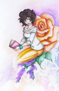
Seriously, it’s beautiful. I eventually stopped caring that there really isn’t much of a plot or purpose and just let myself enjoy the read. It wasn’t so much about the destination but about a slice of life in 1920’s Europe. I wanted to be reading this at an outdoor cafe (impossible to do in wintery northern Utah). It inspired artwork, which I’m going to try and include with every Classics Project post. Since this is primarily an art and design blog, it makes sense to include illustrations or something else somehow related to reading or the book in question.

But back to Hemingway. I’m actually inspired to read more of his books, though I’ll admit that I need to be in the right mindset for them. It’s a different style than I’m used to reading and Hemingway has a very distinct voice. And as beautiful as it was, Sun is also pretty depressing. Everyone drinks rather than deal with their problems. Most of them aren’t even aware that they have a problem, just that they’re not happy. Cohn is downright delusional. Frankly, they’re a ragtag group that should have imploded long before they did at the bullfights. Speaking of the bullfights, I loved those scenes. I know they’re romanticized and the reality is far different, but I found myself immersed in the scenes. I wanted to be there. The sense of festival and controlled chaos just led right into the events that happened within Jake’s group of friends. The fiesta builds and so does the tension. I would have finished the book a lot faster if there’d been more action like the final chapters. I understand why there wasn’t, and since it’s more a look into a slice of life I know that it’s not reasonable. No one’s life can be exciting all of the time and there was a lot of disillusionment with their lives anyway. Which brings us back to the depressing parts.

Still, I liked it. It inspired some artwork, it got me over my Hemingway hatred and got me to read something out of my ordinary. That’s really the whole point of this project.

Now for some artwork:
reading is fundamental
Artist Loft watercolors and Sakura Micron pen. I like that it has a pin-up style, even though it’s not one.

So you wanna see something new. . .

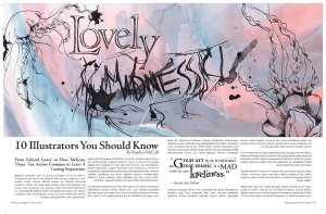
I know I’m behind on posting again, but hopefully this will make up for it. This is a school project for my Expressive and Experimental Typography class last quarter.

We had to do a title done in handmade type of some sort (either drawn, cut out or something to that effect, as long as it wasn’t digital) and use it for a magazine layout. I do a lot of illustrative work, as you know, and it made sense to do something in pen and ink. We’d also had free range to change the subject matter, subtitle and lead-in as long as it was still design related, so I geared it towards illustrators.

Typography Final

I chose a typeface (Centaur MT Std) that was a little more classic. It’s got some nice thicks and thins that work well with pen and ink work and it was fun to play with on “Lovely” and the pull-quote. It really lends itself well to that. The sans serif used for the body of the text is ITC Kabel Std. It’s one of my go-to sans serif fonts. I like the thin lines and I needed something that doesn’t have long ascenders and descenders (which I normally love).

So I took the word “Lovely” in Centaur and played with it until it looked the way I wanted it (fun, but still neat and clean), printed it out and traced it in Sakura Micron pen. (I tried with a dip pen, but it didn’t work out the way I wanted.) I did the hatching to give it some depth and also to echo Edward Gorey (I love the amount of hatching and detail that he’d put into his illustrations). I also do a lot of hatching in my own works. “Madness” was completely hand-drawn and it’s meant to be scratchy and rough. I did probably five different versions and this was the one I liked best. That one is in dip pen. I did a few splatters and dripped water on the wet ink.

The jellyfish and roses turning into jellyfish are a new obsession of mine and they went really well with the words. I actually have another typography assignment that I want to post (once I change out the vector artwork) that sort of explains where the jellyfish thing came from. “Lovely Madness,” of course, comes from the pull quote, which is a favorite quote of mine. The watercolor texture in the background is by Jane-Beata here. I flipped it to be horizontal and made it more muted, but I liked the colors and I liked the feel of watercolors with the hard black of the text and illustration.

I think the leading needs to be tweaked a little (it’s just slightly too close) and I’m still not in love with the lead-in. I tried it several different ways before I settled on this. And as much as I like the colors, I wish I’d played around with them more, maybe trying some cool tones instead. Overall, I was really pleased with it. Of course, the more I look at it now, the more I find things that I don’t like. It’s still good, just not great.

On Art (or, how I learned to get out of the box and love Dali)

Sort of. I’m going to just say it up front: I don’t like Dali. However, there is, like so often in life, a caveat.

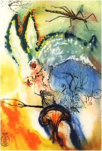
Once upon a time, I associated Dali only with the melting clocks and all of the surreal nonsense that I hated. Then I discovered (by way of a Pawn Stars episode, of all things) that he once did a series of illustrations for Alice in Wonderland. I was entranced. They’re beautiful, colorful and weird in a way that just works with Alice.

Down the Rabbit Hole: Salvador Dali, 1969 image from www.williambennettgallery.com

Down the Rabbit Hole: Salvador Dali, 1969
image from http://www.williambennettgallery.com

If money was no object, you can guarantee that I’d be hunting down one of the full suites.

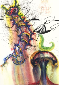
Well, today, I got to see one of the prints in person. I have no idea if it was authentic or not, but I’d like to pretend that it was, and from all I’ve researched, everything looked right. I work in a frame shop and when I started on this order, my first response was “is this what I think it is?” I opened it up and nearly screamed. I certainly danced and squealed like a little girl.

Advice from a Caterpillar: Salvador Dali, 1969 image from www.williambennetgallery.com

Advice from a Caterpillar: Salvador Dali, 1969
image from http://www.williambennetgallery.com

I got to frame this. It was absolutely lovely. When the owner came to pick it up later, I told her that she’d made my day. I love getting to frame things like this. When we get something in that I’m interested in, you can tell. I get as excited as if it were mine, generally cooing “pretty!” as I work, every time I lay a new component down. Mats? “Pretty!” Glass? “Pretty!” The frame? “Beautifuuuuul!” I especially do this if the components actually work well with the artwork and had some thought put into them, other than just a plain black or brown frame and white or black mats.

But back to Dali. If someone had told me years ago that he did more than just the clocks and had actually shown me some samples, I wouldn’t have been so staunchly anti-Dali and refused to even look at books of his work. I love his Alice, and I’ve seen some other sketches that I really like as well. (I also recently framed a poster that featured a horse and rider sketch; it was really cool too.)

My point is, why is it that the mainstream image of an artist has to be pigeonholed? Dali = melting clocks. Picasso = angular, freaky women. Even as an artist myself, if that’s all I first know of an artist, I’m not going to be interested in learning more. In the last couple of years, mostly by accident, I’ve discovered artists that I never would have wanted anything to do with before. If I had seen Picasso’s earlier work or sketches before I’d seen Guernica, I would have been a lot more interested. When it comes to those angular, freaky women, I wish I’d seen Les Demoiselles d’Avignon a lot sooner, because even though I really don’t like cubism, there’s something about that painting that I do like.

I will still never love Dali or Picasso, or probably half a dozen other artists, but I don’t hate them anymore either. Any artists you feel the same way about? Who did you absolutely despise and then find out you shouldn’t have said “I will never like them?”


Projects in progress. . .

I’m working with acrylics again, after a long hiatus in favor of watercolors. I only started using them this past year, thanks to my color theory class. I have hopes of becoming the acrylics instructor at my job, but in order to do that, I sort of need to show that I have some skill! So my winter break has been mostly spent painting. Nothing is finished, but I have several works in progress.

There are two originals that belong to that bigger project of mine. There’s one fanart in progress and two more in the planning stages. Remember that quick little Sherlock sketch I did during Inktober and I said that it might blossom into something more? Yeah, it did. I expected it to be in watercolor, but I’m going to attempt it in acrylic instead. I also have a feeling that I may regret including the London skyline (or at least certain elements of it), as I’m not very good with cityscapes. So far I only have the under-painting done; I need to start sketching out the rest of the elements before finally transferring them over to the canvas board.

I suppose that begs the question: shall I take step-by-step photos of some of these projects? I don’t usually share my process, so it would be something different, plus it would (maybe!) guarantee that I not only post more often but that I finish these projects. (With school starting up this week, I may need a promise to keep.)


In the meantime, have one of the watercolors in my backlog.
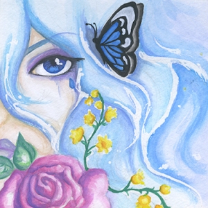
Azure_web
This is an original character of mine, one who’s been around in one form or another for about 12 years. Done in those cheap watercolors of mine with a touch of white acrylic on the butterfly.

New Year! New Plans! New Posts!

So this year I resolve to post more. I know I’ve fallen off the wagon since Inktober, but I’m going to try to be better. I’m also going to try and post about more things rather than just waiting for when I have artwork ready to share. I’ll try to keep it relevant to arts and literature, but I’m going to try to branch out. I’m also going to try and get this blog looking more like a designer writes here!

So for my first post of the year, may I introduce you to a little something I like to call The Classics Project. It’s something I started a few years ago to broaden my reading habits, not because I didn’t like reading “classic” books, but because I’d noticed that I was ignoring them for popular fiction or true crime. So I wrote out a list of one “classic” or otherwise important novel to read per month, including A Clockwork Orange, Slaughterhouse 5 and The Lord of the Flies. These were books that I’d always meant to read or had, for reasons mostly having to do with high school, refused to ever read. (You sit through six nearly identical presentations on Animal Farm and see how you feel about that book.)  I did pretty well. There were a couple that I didn’t get through, either because I couldn’t find them through my library at the time or because I just couldn’t do it. After two consecutive years on the list, I have still not made it through Lolita and I don’t think I ever will. Frankenstein, however, will be getting a third chance because it deserves to be read and I didn’t dislike it.

Some books will be getting a reread. It’s been 20 years since I’ve read Jane Eyre and at least 15 since Black Beauty, which was my childhood favorite.

Hemingway will be getting a chance. And really, it’s Woody Allen’s “Midnight in Paris” that brought this whole thing on, because for the last few years, I’ve skipped the Project. Re-watching that movie a few weeks ago made me want to reread Gatsby and try Hemingway. (My lone experience with the man was The Old Man and the Sea, which I hated with the fire of a thousand suns.) It seemed like a good time to revive the Project. I put a few books on here that I think I’ll love and a few that I am fairly certain I’ll hate, but I need to try them. This also means that I have to post at least once a month. ^_^ Heck, I may even have illustrations to accompany them, if I feel really inspired!

Anyhow, without further ado, I give you the 2014 Classics Project:

  • January: The Sun Also Rises by Ernest Hemingway
  • February: The Great Gatsby by F. Scott Fitzgerald
  • March: The Hobbit by J.R.R. Tolkien
  • April: Black Beauty by Anna Sewell
  • May: A Study in Scarlet by Sir Arthur Conan Doyle
  • June: Persuasion by Jane Austen
  • July: Psycho by Robert Bloch
  • August: In Cold Blood by Truman Capote
  • September: To Kill a Mockingbird by Harper Lee
  • October: Frankenstein by Mary Shelley
  • November: Jane Eyre by Charlotte Bronte
  • December: The Lion, The Witch and The Wardrobe by C.S. Lewis

I assure you, I’m not dead.

Inktober ends and I fall off the face of the earth, right? Well… Sort of.

Original Character; watercolor on mixed media paper

Original Character; watercolor on mixed media paper

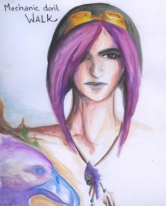
Have a watercolor. This is another OC from that project I’ve been introducing. I’m really super pleased with how it turned out. I’ll eventually add more stuff to it, because it’s actually out of my sketchbook and there’s more character development stuff that I need to add, but right now, it’s just simple and fun and before last quarter I would have stopped where I am and used a clean page for the other stuff. But I’m trying to get better about using the *whole* page in my sketchbooks.

Detail wise, I really like the eye and the feathers. How those feathers turned out so perfect, I will never know and I will probably never be able to replicate. At least not so effortlessly.

I’ve been playing with watercolors more lately, and I have a few that need to be scanned and shared, so keep an eye out!

Oh, and btw, the watercolors? Cheap pan-set from Artist’s Loft for $5. I love them. Yes, they’re chalky, but that’s fine for what I want them to do.

Inktober Mad Rush!

So it’s a mad scramble to get all of my month’s ink work up before the end of Inktober! I hadn’t had time to get them scanned and posted before now. We’ll start with the oldest first.

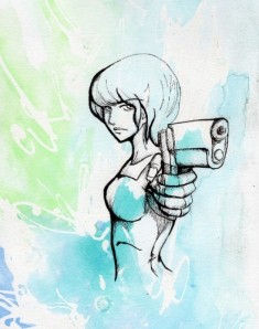
Original Character. Sakura Micron pen and black Prismacolor marker over watercolor wash.

Original Character. Sakura Micron pen and black Prismacolor marker over watercolor wash.

Remember the fairly lousy pinup attempt on the watercolor wash? Same character, done on a different part of the wash. The pose is taken from one in Lee Garbett’s “Draw Comic Book Action.” There’s a few things I’d fix; I haven’t perfected hands holding guns yet, let alone guns. But I like it. She looks like an 80’s anime character, which I didn’t intend on, but it’s good.

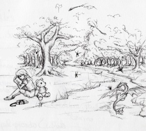
Inktober. Sakura Micron Pen, based on A.A. Milne's "Us Two."

Inktober. Sakura Micron Pen, based on A.A. Milne’s “Us Two.”

Sakura Micron again. It’s rough, but that’s what I wanted. I too often try to do fully rendered work and it just takes me forever or I lose interest. I wanted this to be quick and dirty. It’s inspired by A.A. Milne’s “Us Two.” Particularly the version read by Helena Bonham Carter and Tom Hiddleston.

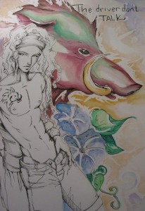
Original. Sakura Micron, dip pen with black acrylic ink and cheap watercolors.

Original. Sakura Micron, dip pen with black acrylic ink and cheap watercolors.

Remember this guy from the beginning of the month? I got his tattoo added on and got the background done. The progress isn’t officially part of my Inktober offerings, because the new stuff was done in watercolor (cheap ones, btw. I use a set that cost $5), but I did go over it in places with a dip pen and acrylic ink.

Which leads us to:

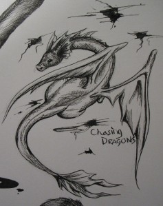
Dragon, done with a dip pen and acrylic ink.

Dragon, done with a dip pen and acrylic ink.

The pencil work was done a week or so ago, right around the time I did the Christoper Robin and Winne the Pooh piece. I inked it tonight, in between trick-or-treaters. He kinda looks like Hakuryuu from “Saiyuki,” but that’s okay. A different pose would show some anatomical differences (mine has front legs) but I think Hakuryuu is adorable, so there.

The important part is that this is my second *real* attempt at using a dip pen. I’m using a cheap one with the acrylic ink it came with, because I want a feel for it before I invest in India ink and better nibs. I don’t know that I love it for my hatching because I’m so detailed and heavy with it, but I do love the outlining it does. Haven’t tried it with a brush yet. And the first attempt? You’ll have to wait to see that. I’m using it for a class project, but let’s say it did what I wanted it to.

Inktober 30

I haven’t had too much time to work on Inktober because of school and work. Luckily, for a school assignment I decided to hand-draw the graphics and it’s in ink!

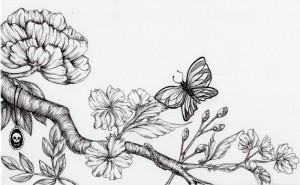
butter LONDON floral in Sakura Micron pen

butter LONDON floral in Sakura Micron pen

For one of my classes, we’re having to make a POP display and I chose to do it for butter LONDON nail lacquer. Since I couldn’t find any graphics large enough, I decided to make my own, particularly after I found a really nice ink illustration of their raven logo. I draw a lot of cherry blossoms and roses (peonies aren’t too far off from roses), which is what they use for their website and packaging. I’ll confess, this was actually the only part of the assignment I’ve enjoyed.The final product will end up in color, so before I add the color, I want to share the black and white version. I actually wish I could leave it in black and white.With any luck, I’ll get one more in for Inktober before tomorrow night!